2 IM Data Hub Components
2.1 Introduction
Now that you’re already started, and you’ve got some essential background about the IM Data Hub, we are going to explore the details/components that form the IM Data Hub.
The IM Data Hub is not just a database: it’s rather a project monitoring system, and it’s meant to monitor IM indicators and support decision-makers.
Understanding the IM Data Hub components will allow you to report, analyse, and monitor IM indicators more effectively. We’ll dive deeper into the components and understand how they are set up in the IM Data Hub.
This section shows you the reporting component, mainly the data sets that the IM Data Hub uses to collect indicator data. We will then walk through the data mining piece, and how the different outputs are pulled together on a dashboard for the project use.
2.2 Reporting Component
Reporting into the IM Data Hub to inform the IM Performance Monitoring Plan (PMP) indicators is organized through the use of data sets. A data set is simply a list of data elements that are grouped for data collection.
A data set has a reporting period and is assigned to organization units. The reporting period specifies how often the data is reported, ie. monthly or quarterly, while the organization units determine the location “where” the information is collected from.
The IM Data Hub has two main types of data sets:
- Global data sets that are common to more than one country (ie. IM Seasonal Malaria Chemoprevention),
- Country specific data set that are specific to countries (ie. GH Case Reporting).
The data sets are accessible through the data entry app (Fig. 2.1) and they appear as forms. They are designed to mimic the paper forms to allow ease of data entry/reporting process.

Figure 2.1: An icon of the data entry app
2.2.1 Global data sets
Global data sets are accessible to relevant countries and are meant to collect data to inform country and global PMP Indicators.
As of Dec 2019, there are five global data sets in the IM Data Hub and all of them begin with IM followed by the [data set name] as shown below in yellow (Fig 2.2). Global data sets are divided into sections (in grey) that groups IM data elements into multiple subheadings for ease of data collection. There are five main sections:
- Diagnosis
- Treatment
- MIP
- Technical leadership
- Seasonal Malaria Chemoprevention
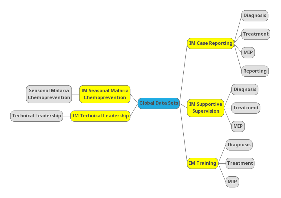
Figure 2.2: Global datasets
2.2.1.1 Accessing Global data sets
- If you haven’t already logged in yet, please log in now at:
Username :demoUser and Password : ask your System Admin
Search for the Data Entry App from Apps
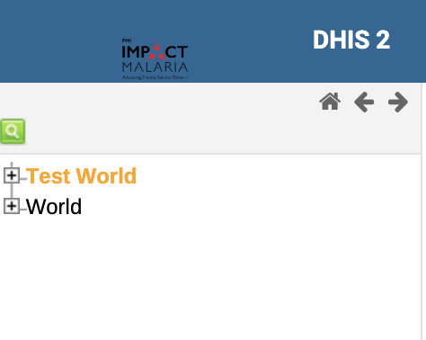
Click on the test world on top left if not already selected
Select
IM Case Reportingdata set and the period to report, ie. October 2019.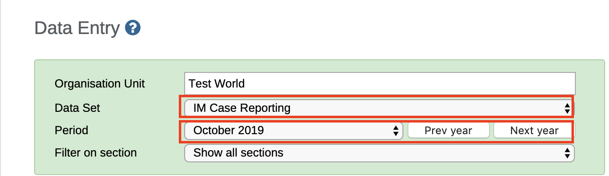
- Wait for the data entry form to load, and check that you can see the same screen as in Fig 2.3 below. Congratulations! You can now start reporting.
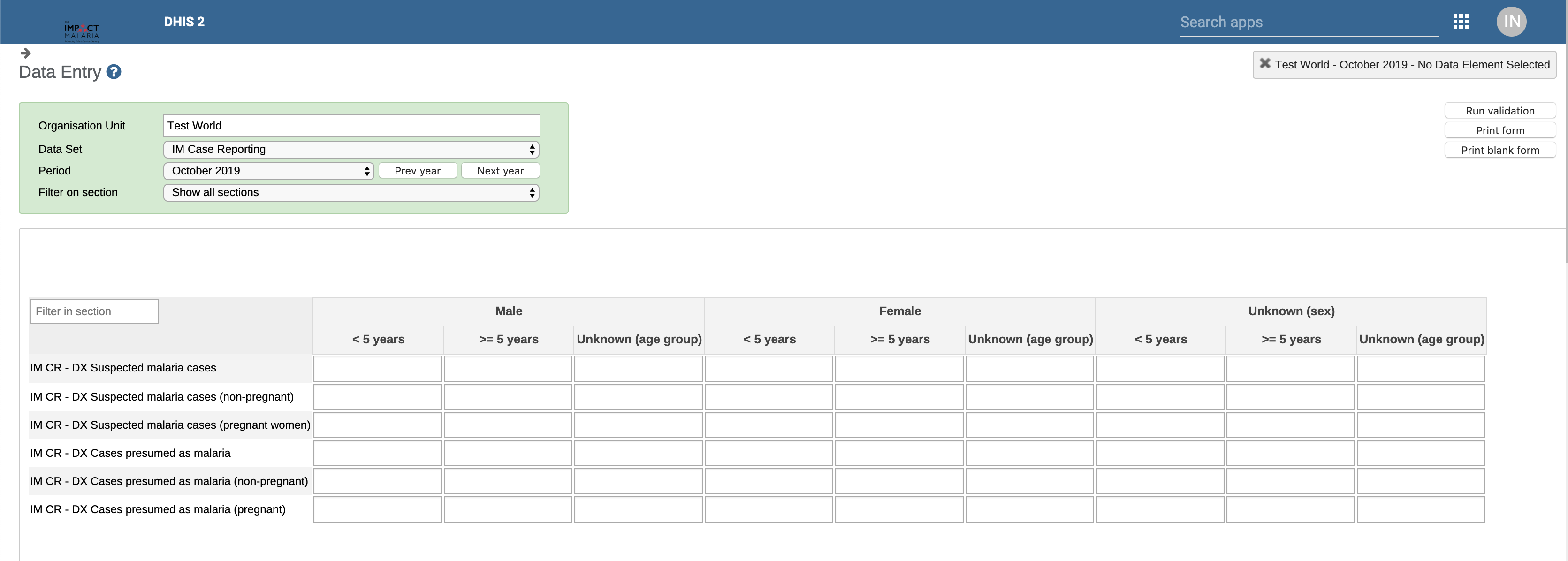
Figure 2.3: IM Case Reporting Data Entry Form
Before completing the records, please notice the Run validation button at the top right.
The complete button submits the records into the IM Data Hub.
2.2.2 Country Specific Data sets
Country specific data sets are used to report country’s Performance Management Plan (PMP) indicators which will ultimately inform the global IM PMP indicators. They are accessible at the desired frequency of reporting (ie. annually, quarterly or monthly) and at the relevant level of data colleciton (ie. national, province, district or facility level).
Similar to the global data sets, country specific ones are organized in sections (in grey) with multiple subheadings. Fig 2.4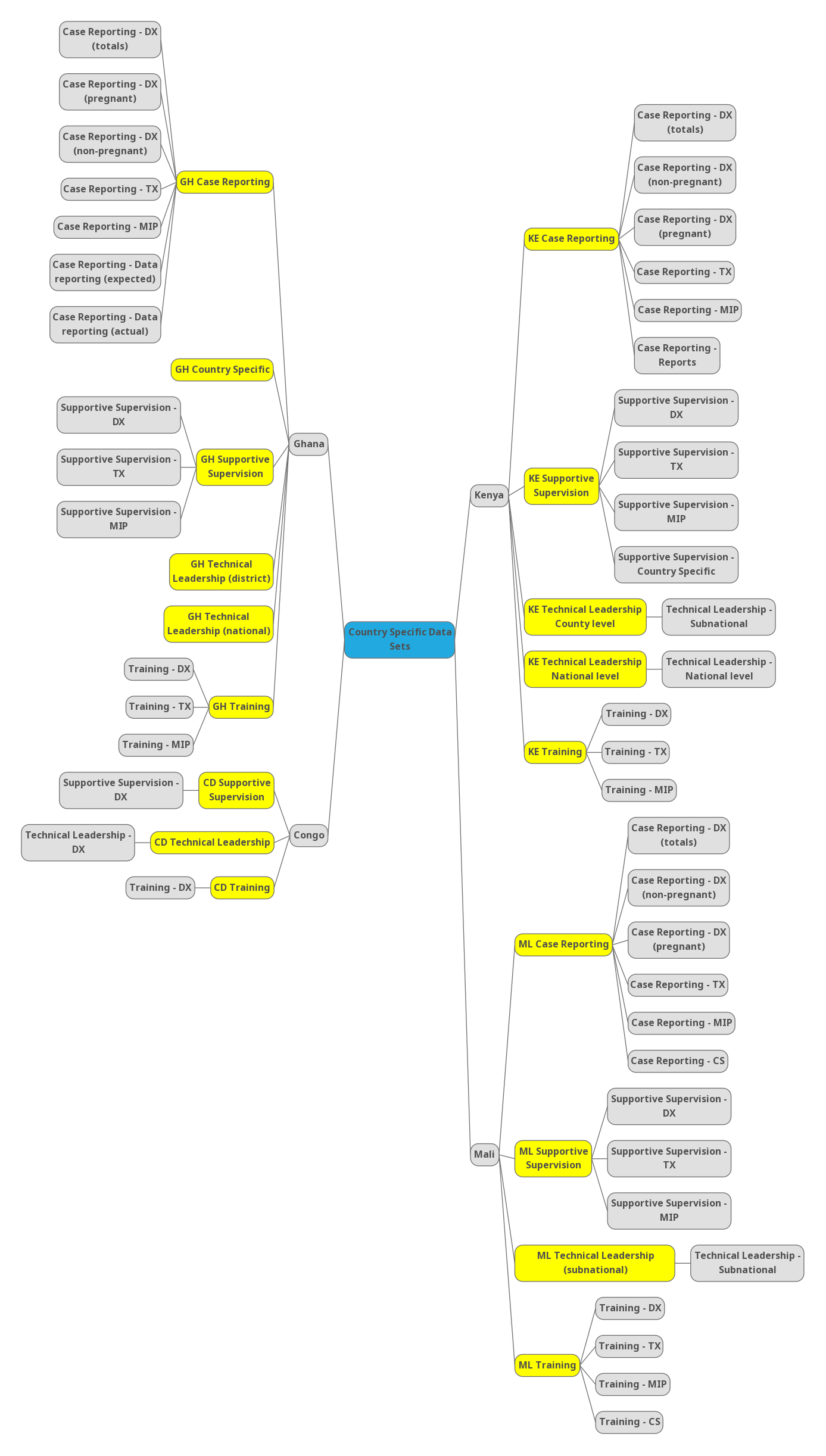
Figure 2.4: Country Specific Datasets
2.2.2.1 Accessing Country Specific Data sets
Follow the same steps in section 2.2.1.1 to launch the data entry app. Ensure you are looged in with your country demo account (ie.
Username:GHdemoandPassword: ask your System Admin).On the left bar, select the relevant org units you want to report from.
Select the relevant data set (ie.
[Country ISO] Case Reporting) and the period to report (ie. October 2019).Wait for the form to load.
For some countries like Kenya, Ghana and Mali, the reporting process for some data sets (ie. [Country ISO] Case Reporting) is automated through scripts.
2.3 Data Mining Component
Once the data is collected or loaded into the IM Data Hub, it then becomes available for data mining. Data mining is a technical process that involves the extraction and analysis of data to generate information.
The data mining component provides tools for enabling the extraction and analysis of the IM PMP indicator data. The information collected through the data elements which compose the global and country specific data sets is pulled into global and country specific PMP indicators. Both the data elements which compose the global and country specific data sets and the global and country specific PMP indicators can be analysed and visualized in the DHIS2 analytics apps.
- Pivot Tables - extracts data in a tabular format and enables the ability to pivot data elements and indicators,
- Data Visualizer - generates a variety of charts like standard line, bar charts, pie charts, etc, to pivot data elements and indicators,
- Maps - gives the ability to visualize IM data elements and indicaotrs on a map.
2.3.1 Pivot Table
If you are familiar with Excel, you are probably aware of “pivoting” as the ability to summarize data on tables in multiple dimensions. Excel Pivot Tables have inspires the DHIS2 Pivot Table app.
Pivot Table offers quick access to IM data in a tabular format. It allows the ability to ‘pivot’ data in several dimensions, such as indicators, data elements, periods, and organization units.
In the following subsection, we are going to access and tabulate a sample of IM indicator data using the Pivot Table app.
As an example, we tabulate and pivot IM Confirmed vs. Suspected Malaria Cases for last 12 months at the global level (world).
- Please refresh your browser or login with the demo account below if you have not.
Username :demoUser and Password : ask your System Admin
- From Apps select or search for Pivot Tables
Figure 2.5: Searching Pivot Table App
Click to launch the app
From the indicator group on your left, select IM PMP indicators and then search % of confirmed case and % of suspected malaria cases
- Make sure you pull all the PMP indicators to the right side
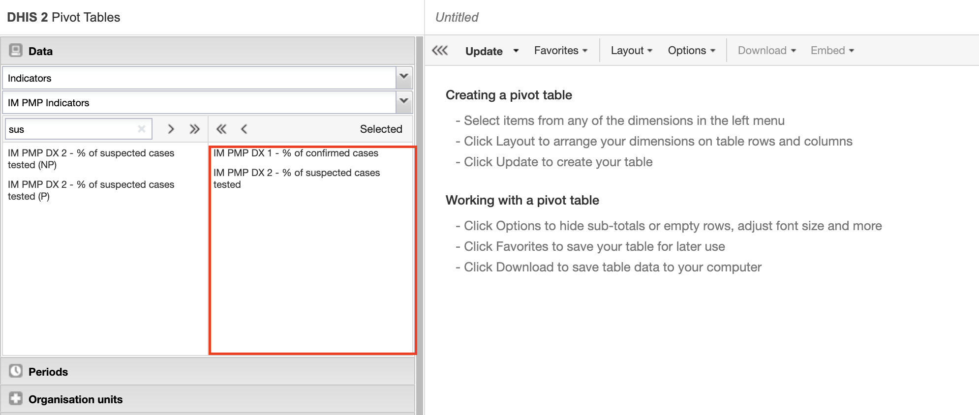
Figure 2.6: Selecting Indicators in the Pivot Table
- Open the organisation unit tab and select world
Figure 2.7: Selecting the organisation unit
At least three dimensions must be specified: what, when and where in the pivot table.
- Click on the update button to generate the report. Check that you can see a table like this one (fig 8). Congratulations! We have tabulated our report.
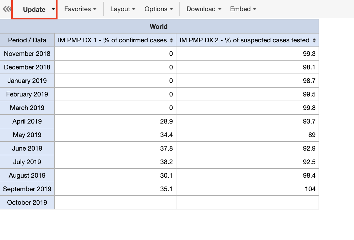
Figure 2.8: Updating the Pivot Table
Save the table as
IM PMP - % of confirmed vs suspected cases last 12 months, global.
2.3.1.1 Best practices, tips & tricks
- Hide empty rows/columns is a very useful Pivot Table option when analysing data across many org units or periods with gaps in the data,
- Sort your table quickly by clicking on the sort symbol inside the column header cells,
- You must always save your table as a favourite before you can add it to your dashboard or share it with colleagues,
- You can add color legends to your table (coloring of cells based on their values) under Options. Multiple legends can now be assigned within the same table and are created in the “Legends” portion of the maintenance app.
Next we will create a chart of these using the data visualizer app.
2.3.2 Data Visualizer
Data Visualizer allows you to generate various charts, including bar charts, line graphs, pie charts, etc., directly in the IM Data Hub. They follow the same design and logic as the Pivot Table app, but they don’t allow for a dimensional analysis which includes more than one factor.
- The easiest way to visualize the table in a chart is to open this table as a chart Fig. 2.9.
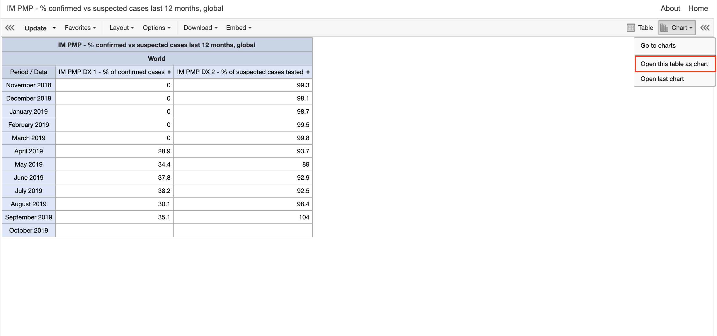
Figure 2.9: Opening this table As a Chart
- You can as well navigate directly to the Data Visualizer app by selecting the first option
Go to chartsor launching it form the apps menu. We will open ours as chart. Check that you see a chart as in (fig 10).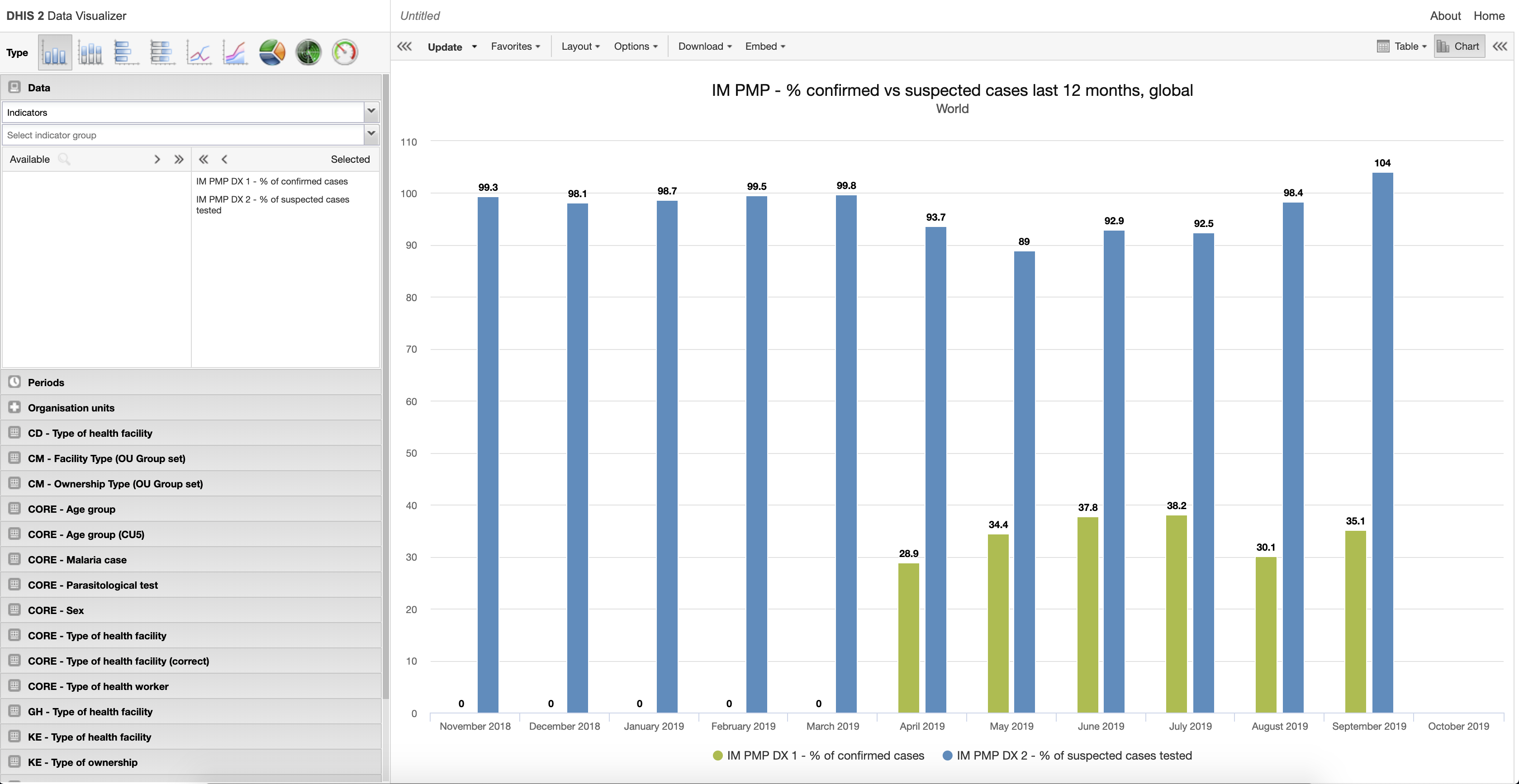
Figure 2.10: A bar chart generated by Data Visualizer App
By default, open this table as chart will attempt to visualize the table in a bar chart. We can switch to this chart to different types by selecting the type. Ensure you choose the appropriate type.
We’ll stick to this as it is the most appropriate for this case. It shows the comparison.
Save your chart as
IM PMP - % confirmed vs suspected cases last 12 months, global
2.3.3 Maps
The Maps app allows you to set thematic layers of the areas and points, view facilities based on classifications, and visualize catchment areas for the geographical distribution of the IM data elements and indicators.
Example: Malaria Confirmed Cases in the last 3 months by region, Ghana.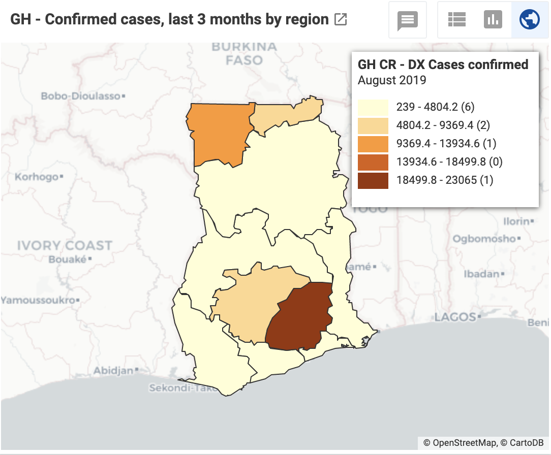
Figure 2.11: Malaria Confirmed Cases last 3 months by Region, Ghana
To create the map:
- Navigate to the
Mapsapp
Figure 2.12: The Maps App
Click the icon
Mapsto launch the app- Add a
thematic layer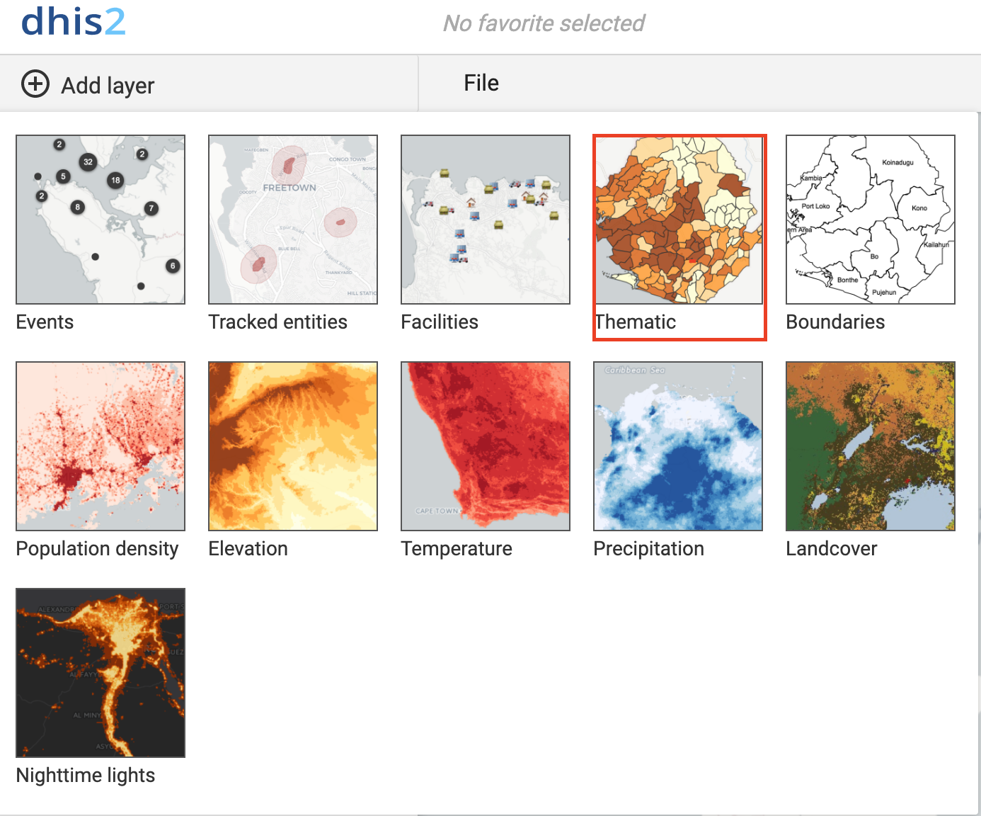
Figure 2.13: Select thematic layer
- Follow the steps to select the dimensions; What, when and where
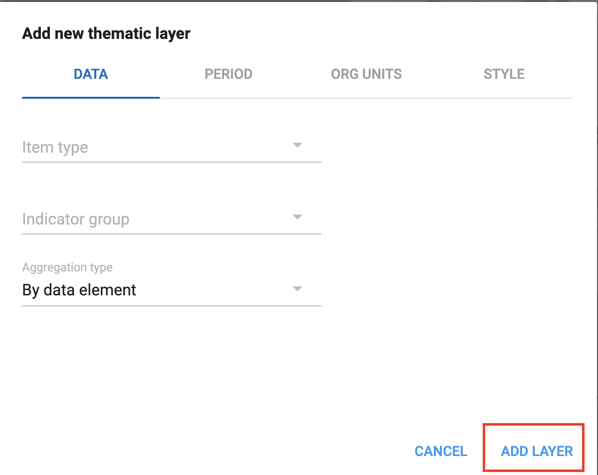
Figure 2.14: Steps to select the dimensions; What, when and where
Update the layer
2.3.3.1 Best practices, tips & tricks
- Try not to put many overlapping layers on a map that will be difficult to interpret,
- Use different color schemes when displaying multiple layers on a map,
- The ordering of the layers is 1: Top Most Layer - 4: Bottom Most Layer. Add thematic layers to the map with this in mind.
2.4 Data Presentation
Once the IM data elements and PMP indicators are analyzed, processed, and you’ve come up with different information products, the next big thing is how this information is used in the routine monitoring of the project.
Data use is an art by itself. Some several guides and structures attempt to promote data use. For the IM Data Hub, we promote the use of the Data-to-Action (D2A) frameworks as a tool to strenghten data use for decision-making.